Very soon, Moodle 4.0 – the latest and most user-friendly version of the platform to date will launch. After spending lots of time consulting with teachers, learners, developers and administrators, Moodle have come up with something more slick, modern, and reliable that will make course management so much easier. As educators prepare for this exciting transition, it’s vital to familiarize themselves with the new features and enhancements that Moodle 4.0 offers. To facilitate a smooth shift, consider following some essential moodle 4.0 preparation tips, such as exploring the updated interface and taking advantage of the comprehensive training resources available. Embracing these innovations will not only streamline the teaching process but also enhance the overall learning experience for students.
In this first in a series of four blog posts, we introduce you to the new Moodle navigation system, which aims to make navigating your courses easy and effortless, for learners and educators alike. With the upgraded navigation features, users can quickly access essential resources, enhance their learning experience, and streamline course management. Discovering the allinone moodle site benefits will empower both students and instructors to maximize their time and engagement while fostering a more collaborative environment. Embrace this innovative approach to learning and take full advantage of the tools designed to support your educational journey.
So, what’s the new Moodle navigation?
Moodle have designed a fresh and contemporary interface that creates an intuitive user experience, improving the core Boost theme. The enhanced design not only simplifies navigation but also enhances functionality for both educators and learners. Among the highlights of this update are the moodle 4.0 new icon features, which provide clear visual cues for various activities and resources. This makes it easier for users to identify tools at a glance, contributing to a more efficient learning environment.
Key Takeaway: The new Moodle navigation is now horizontal, offering several menus instead of just the one.
My Courses
The standalone ‘My Courses’ page helps educators and learners manage all their courses in one setting. This overview page allows learners to quickly search and organise their courses according to their preferences. This page has been moved from the dashboard to give more space to other important tasks.
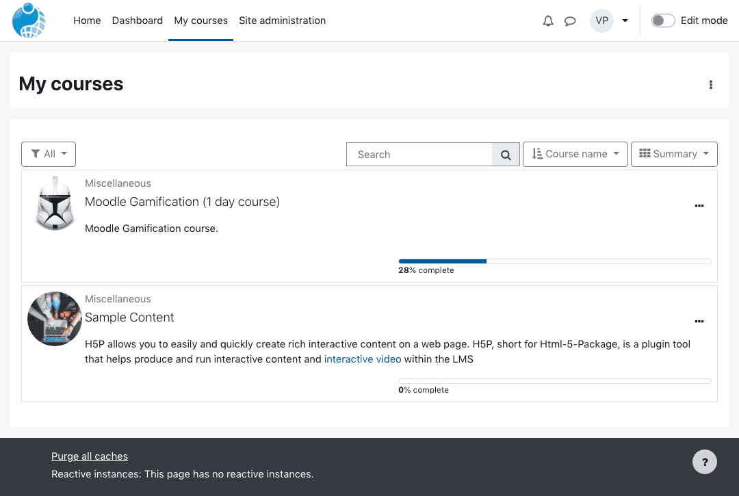 My courses – Summary layout
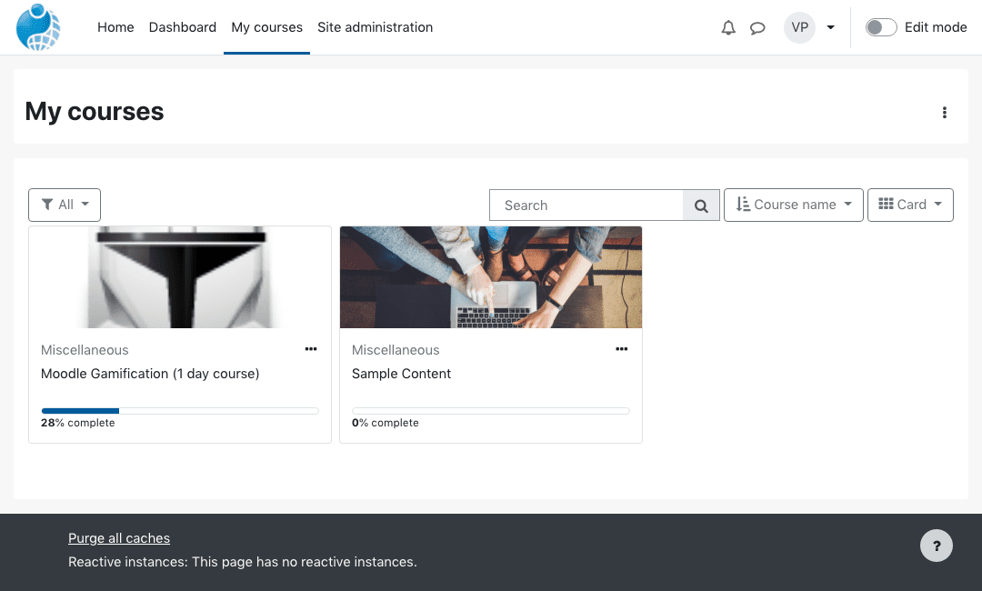 My courses – Card layout
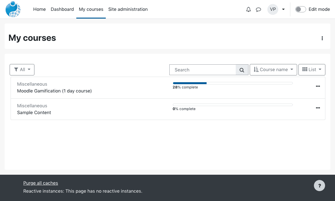 My courses – List layout
Course Completion
Students can quickly view information on deadlines and completion dates. Badges allow users to monitor their own progress and plan their learning, by helping them keep track of what they need to do in order to complete the course.
Secondary Navigation Menu
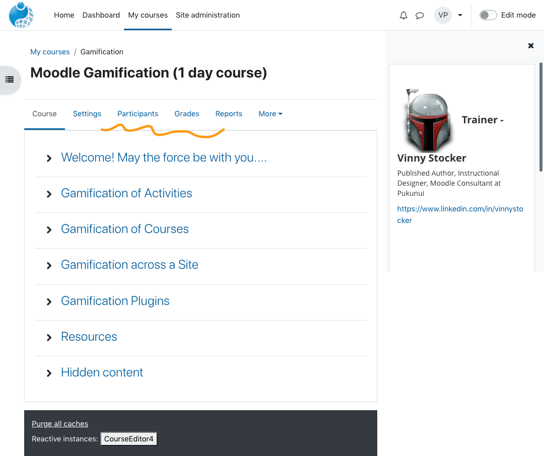
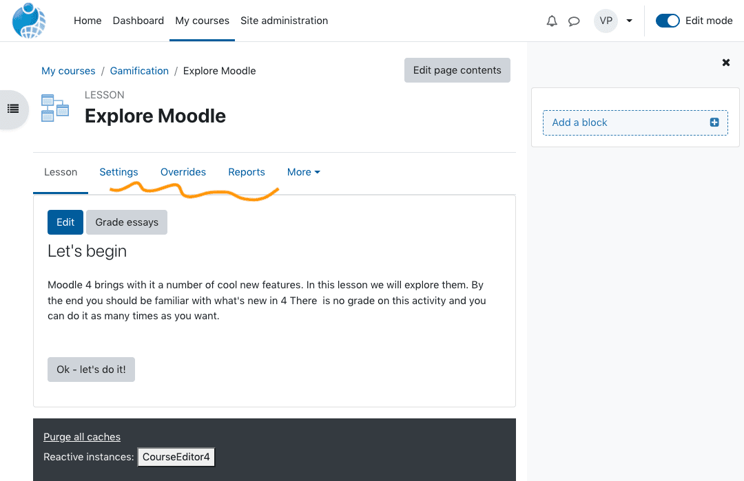
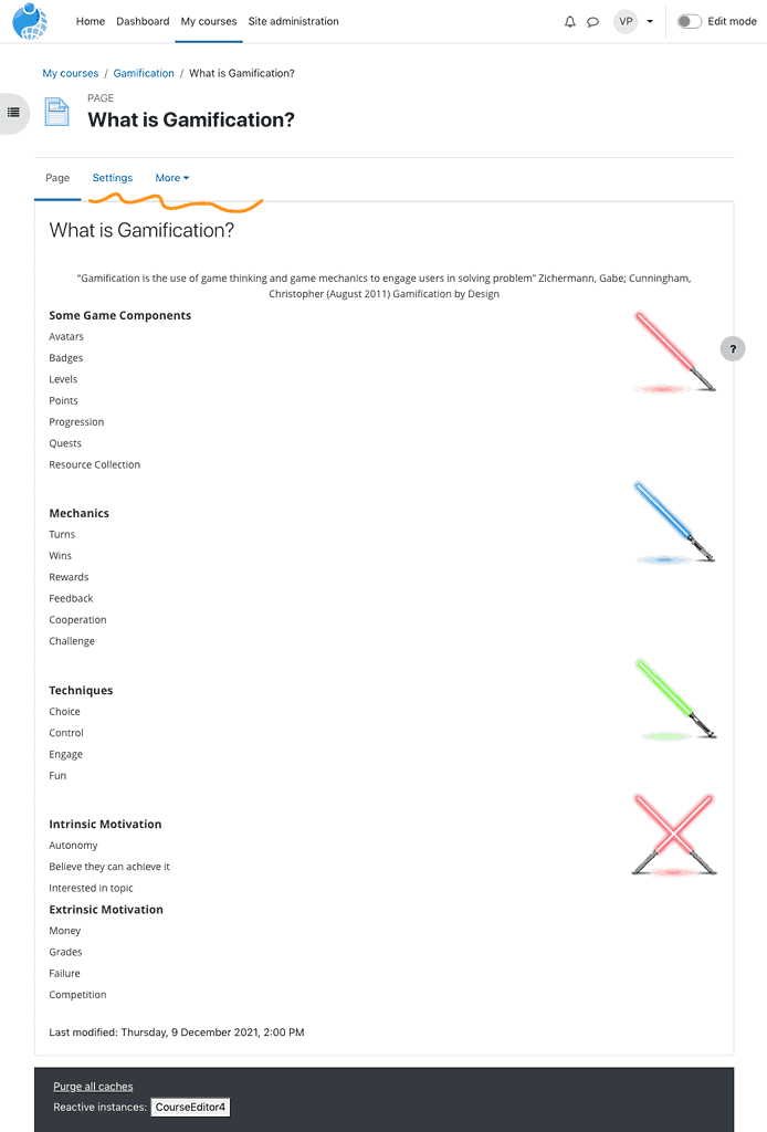
The primary navigation menu remains customisable so that you can add items or include dropdown options. Now, however, a new secondary navigation menu sits under the primary navigation component.
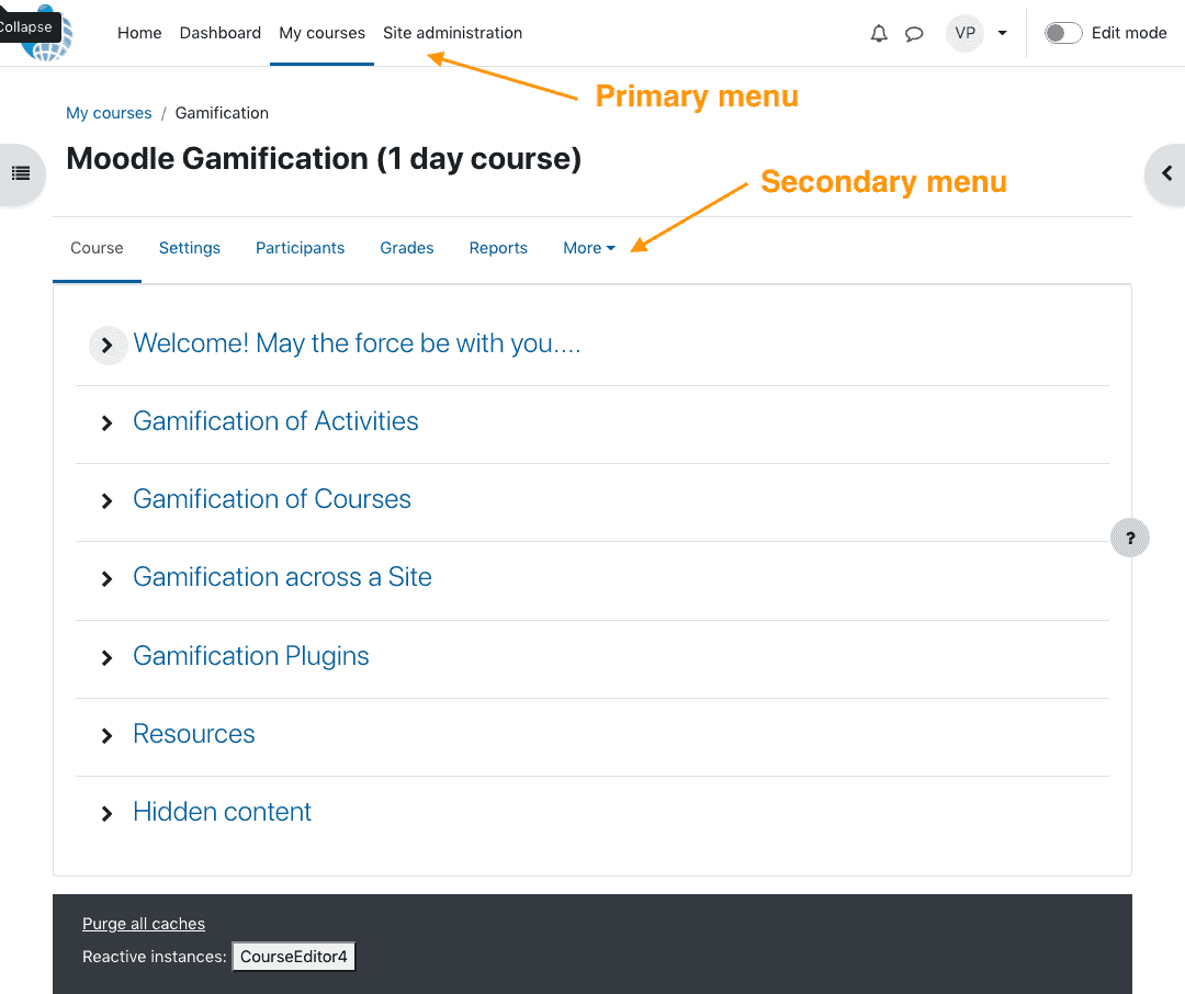
The secondary navigation design mirrors the primary navigation but prioritises important information, based on extensive user research and consultation with the Moodle community. For example, the settings menu is now placed more prominently than before. The ‘More’ option allows users to access an overflow of less important functionalities. This new secondary navigation menu is dynamic, displaying different content depending on the context.
Course Index and Moodle Blocks
To the top left of the screen there is a new icon to show and hide the new Course Index menu. This lists topic headings and activities on the course. Similarly an icon on the top right of the screen allows users to access Moodle Blocks that relate directly to the course content. Blocks can contain relevant details on further reading, tutorial videos, deadlines etc. Users can toggle between the course index and block icon or keep both in view.
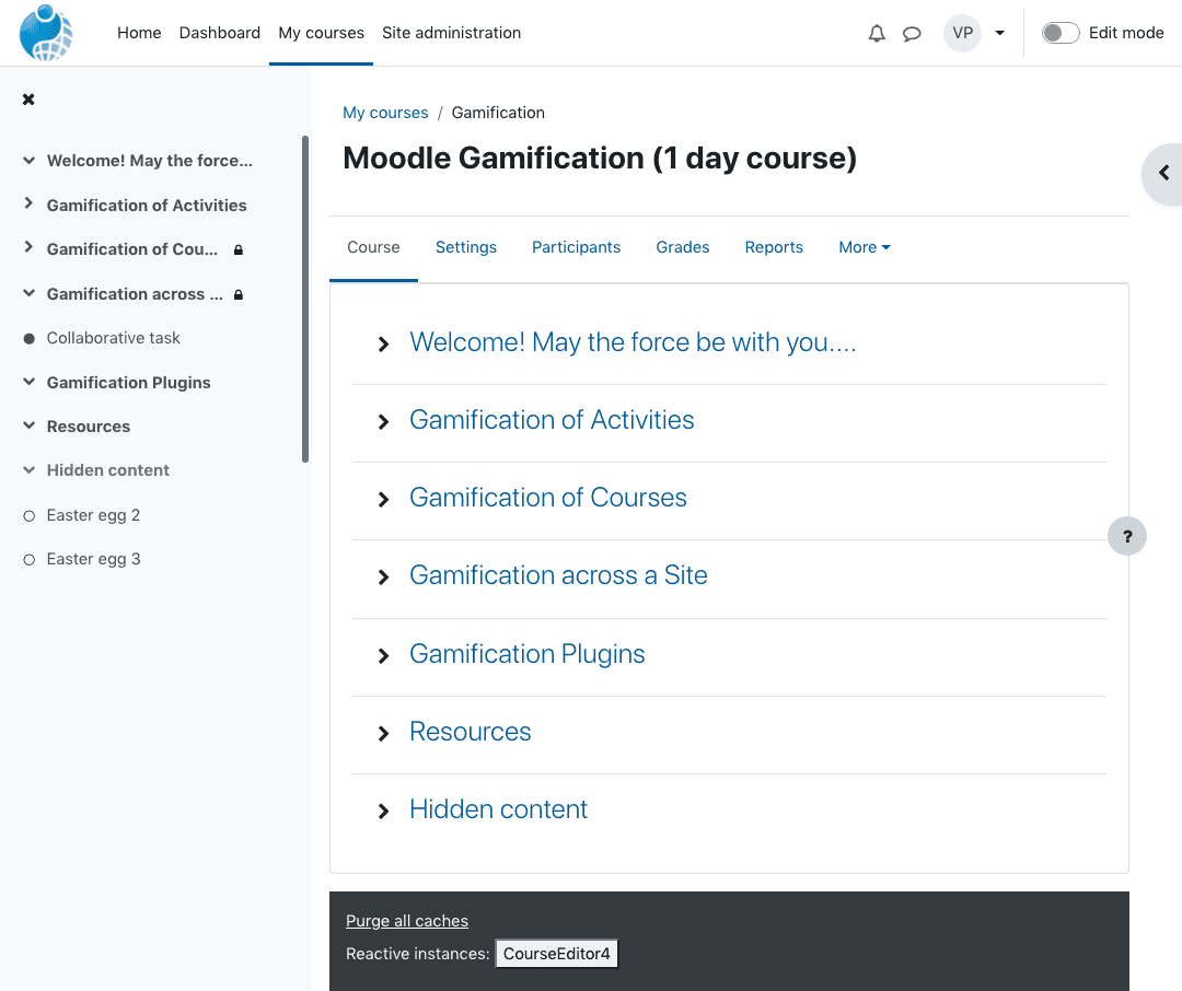 Course Index menu
The new UX is mirrored across desktop, mobile and tablet devices to create a consistent feel.
We’re excited here at Pukunui about this latest iteration of the Moodle platform. Navigation is one of the most critical elements of course design, so we are pleased that the Moodle 4.0 has taken user feedback into account and created this streamlined system. In addition to the improved navigation, the updated platform introduces several innovative tools aimed at enhancing the learning experience. The moodle dashboard features overview highlights these advancements, allowing educators and students to easily access key resources and track their progress. We believe this will significantly contribute to more dynamic and engaging online courses.
In the next blog, we’ll look at the revamped course page structure.
If you would like to install Moodle as your LMS platform, get in touch with us to discuss the options.

