In this second post about the upcoming Moodle 4 improvements, we introduce you to the new Moodle icons and some changes to the course page structure. The ability of users to manage the information on courses they are taking – such as how much they have completed, level of attainment, etc – are critical to the learner experience. The updated icons will provide a more intuitive navigation experience, making it easier for users to find the information they need. Additionally, the moodle dashboard features overview will empower learners by offering personalized insights into their progress and achievements. These enhancements aim to create a more engaging and efficient learning environment for all users. Additionally, these enhancements aim to streamline navigation and provide clearer visibility of progress indicators. As institutions prepare for the transition, implementing effective moodle 4.0 preparation strategies will be vital for ensuring a smooth adaptation for both instructors and students. These strategies will help in maximizing the benefits of the new features and fostering an engaging learning environment.
The new course page design uses a clean interface and takes into account the most common user flow, based on Moodle’s extensive research.
So, what’s new?
View Courses at a Glance
As discussed in our previous post the course information cards on the new “My courses” page have been simplified, to allow users to quickly access information on courses and completion details.
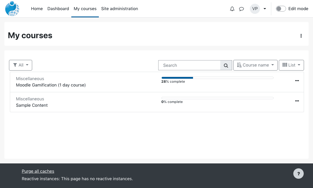 List layout
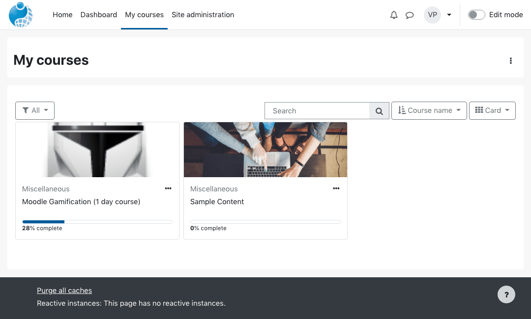 Card layout
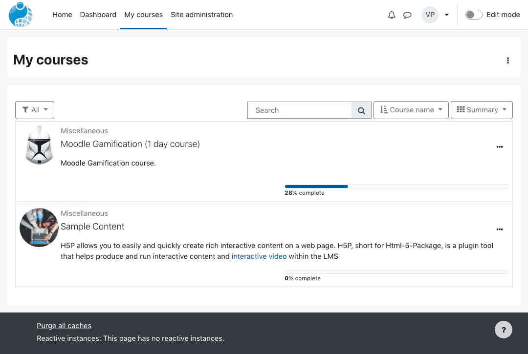 Summary layout
Course Index Side Bar
The newly streamlined course index allows both educators and learners to find activities and resources at the touch of a button. What’s more, they can expand the dropdown links, to help understand the course structure in depth and keep track of their progress. This means less time scrolling and more time learning!
You’ll notice on my screenshot below, the activities are also shown on the Course Index, including an indication of whether that activity has been completed or not.
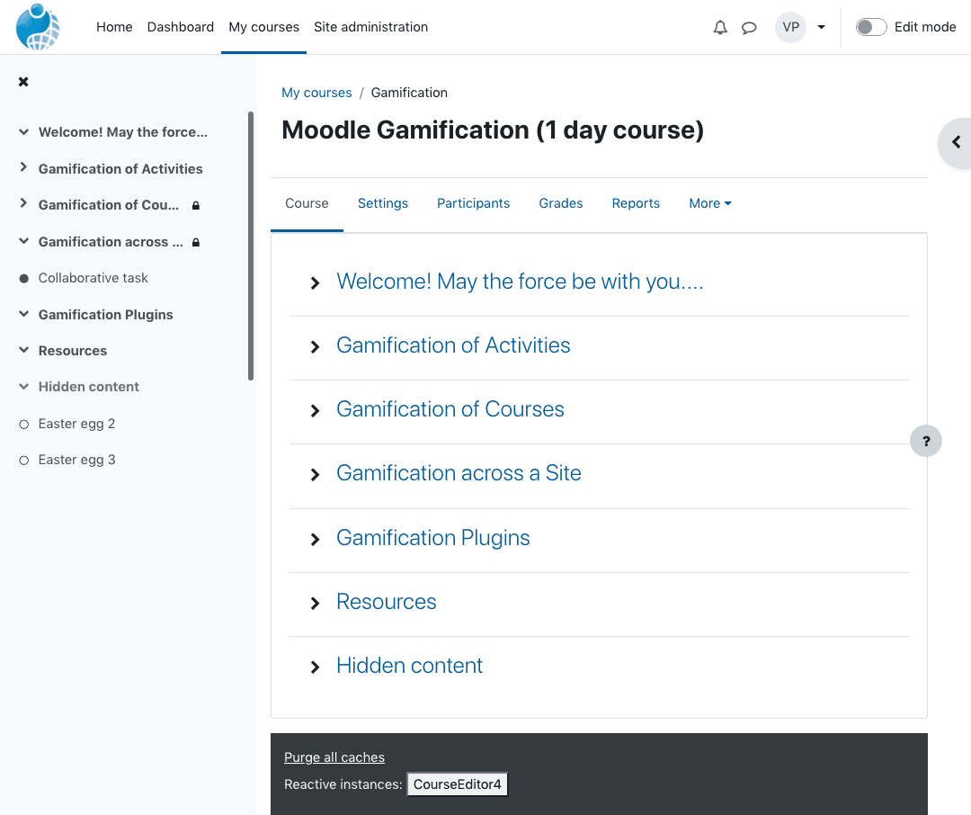 Completed activities shown with a green dot on the Course Index
Educators can also use this function to drag and reposition different elements of the course. Site navigation has been improved to complement these improvements. You can read all about those improvements here.
New Moodle Icons for Activities and Resources
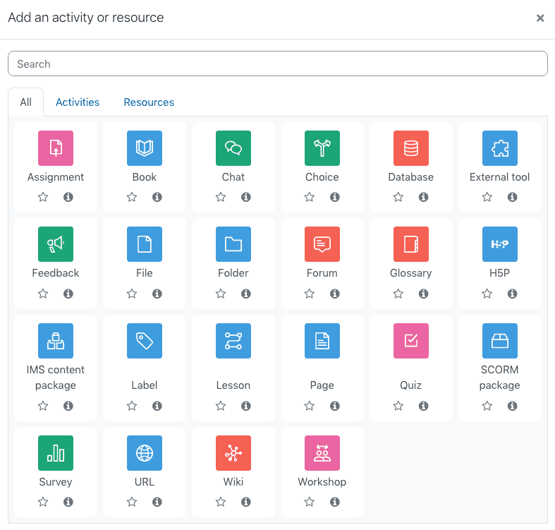
Moodle’s activity icons have been redesigned to offer a colourful and intuitive activity reference for learners, based on their educational impact. These enhancements not only make it easier for students to identify different types of activities but also encourage participation by making the learning experience more visually appealing. Additionally, these changes align with some of the top Moodle features for student engagement, fostering a more interactive and collaborative environment. As learners navigate through their coursework, the bright icons serve as a guide, helping them to quickly access the materials that will benefit them most.
What is interesting, is that the colours are based on the purpose of the module, as defined by the plugins database on https://moodle.org/plugins/
Administration – Blue / Purple – #5d63f6 (not shown above)Assessment – Pink – #eb66a2Collaboration – Orange – #f7634dCommunication – Green – #11a676Content – Light-blue – #399be2Interface – Purple – #a378ff (also not shown above)
These colours can be changed by adding a little custom CSS to the theme settings via the admin interface.
* All activity icons have been replaced with black monochrome icons. The background colour for these icons is defined using a new ‘FEATURE_MOD_PURPOSE’ support variable in the module lib.php fileAvailable purpose types are: – MOD_PURPOSE_COMMUNICATION – MOD_PURPOSE_ASSESSMENT – MOD_PURPOSE_COLLABORATION – MOD_PURPOSE_CONTENT – MOD_PURPOSE_ADMINISTRATION – MOD_PURPOSE_INTERFACE – MOD_PURPOSE_OTHERThe colours for these types are defined in theme/boost/scss/moodle/variables.scss
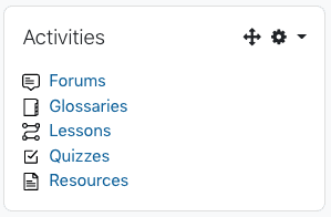 New Moodle icons shown in the Activities Block
You can read about the details and ongoing changes here https://tracker.moodle.org/browse/MDL-71457
Add New Topic Sections
In addition to the above, educators can now add new topic sections with one click. The interface used to move activities around is being simplified. Short, clearer descriptions make it easier for users to navigate and find your activity quicker.
 One click – Add topic
Finally, Moodle’s Student Activity Completion will be further enhanced to offer details on completion criteria and other important details.
Developers at Moodle are still working on making improvements to the course page. The finished product should work really well in terms of operability and compatibility. We’re excited here at Pukunui about this latest iteration of the Moodle platform. Soon, users will be able to access more information on their learning journey in a way that saves time and makes the whole learner experience more pleasurable.
In the next blog, we’ll look at the revamped dashboard.
If you would like help with your LMS platform, get in touch with us to discuss the options.

